Santa Arquitectura: Portfolio for the Barcelona architecture practice of Noelia de la Red. A wordmark, a clock, and photographs that follow the cursor.
Santa Arquitectura · 2025 · Design: Maat Studio · Creative Direction: Paco Díaz · Visit the site ↗
The brief
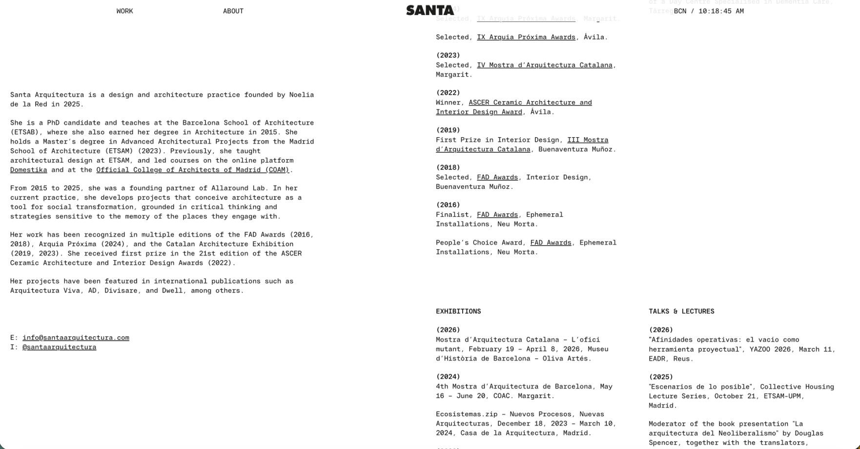
Santa Arquitectura is the practice of Noelia de la Red: new in name, ten years deep in work. Eighteen projects photographed at print resolution, plans and sections drawn with the same care, and a design by Maat Studio that asked for almost nothing on screen. A wordmark, two links, the time in Barcelona, and the pictures. The site had to hold that discipline on every page, not just the first.
The decision
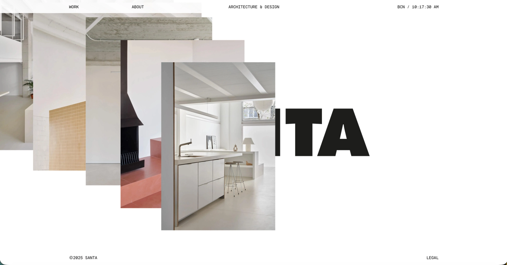
The home page is the wordmark until you move. Photographs drop where the cursor passes and stay there, a trail of the studio's work laid over SANTA in whatever order you draw it. Leave the page and the wordmark shrinks into the header, beside the clock.
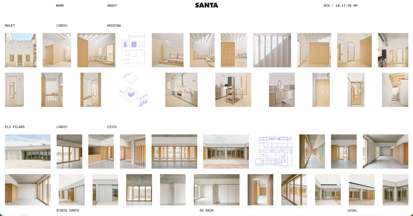
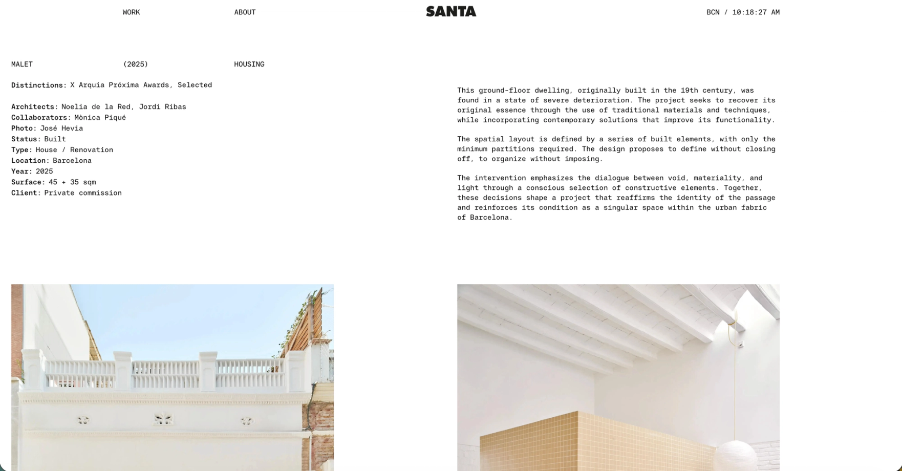
Work is a three-column grid where every photograph keeps its own proportion, captioned like a drawing: name, year, typology, in monospace. One word in the footer, Overview, swaps the grid for a contact sheet, every project with all its images in a row, the whole archive on one screen. Inside a project the data sheet reads like a title block, and the drawings sit among the photographs as equals: plans and sections in blue line, at the same width as the rooms they describe.
The part nobody sees
The trail and the portfolio are one set of photographs. Nothing on the home page is decoration: every picture the cursor leaves behind belongs to a project, and the studio adds to the trail simply by publishing work. The contact sheet is the same archive again, close to three hundred images, indexed rather than curated.
Images resolve out of a blur instead of snapping in, so a page ten thousand pixels long composes as you scroll. Drawings go through the same pipeline as photographs, with their own proportions kept, and the studio publishes projects from the CMS: photographs, drawings, a data sheet. The site does the rest.
Next