Isern Serra: Portfolio for the Barcelona interior design studio. Sixty-odd projects, a header that rearranges itself, and pages the studio composes block by block.
Isern Serra · 2024 · Design: Phantasia Services · Visit the site ↗
The brief
Isern Serra's work is spaces: bakeries, showrooms, apartments, a stand, an object, photographed by people who know how to photograph space. The site had to feel like those rooms, calm and exact, with nothing on screen that was not the work. Design by Phantasia Services meant four words, photographs, and a few gestures that had to be built rather than styled. And every project tells its story differently, so the studio needed to decide, case by case, how text and images sit on the page.
The decision
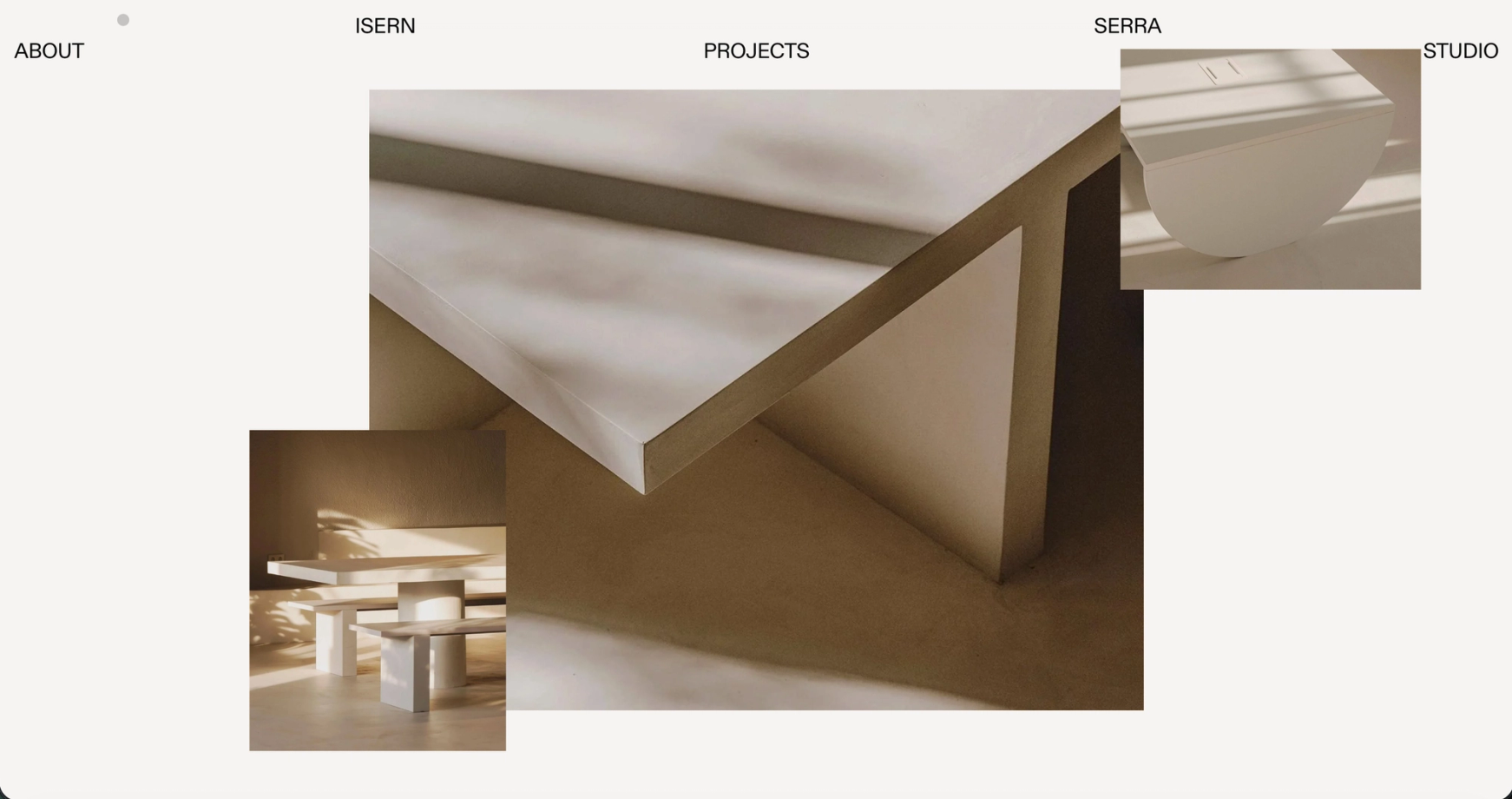
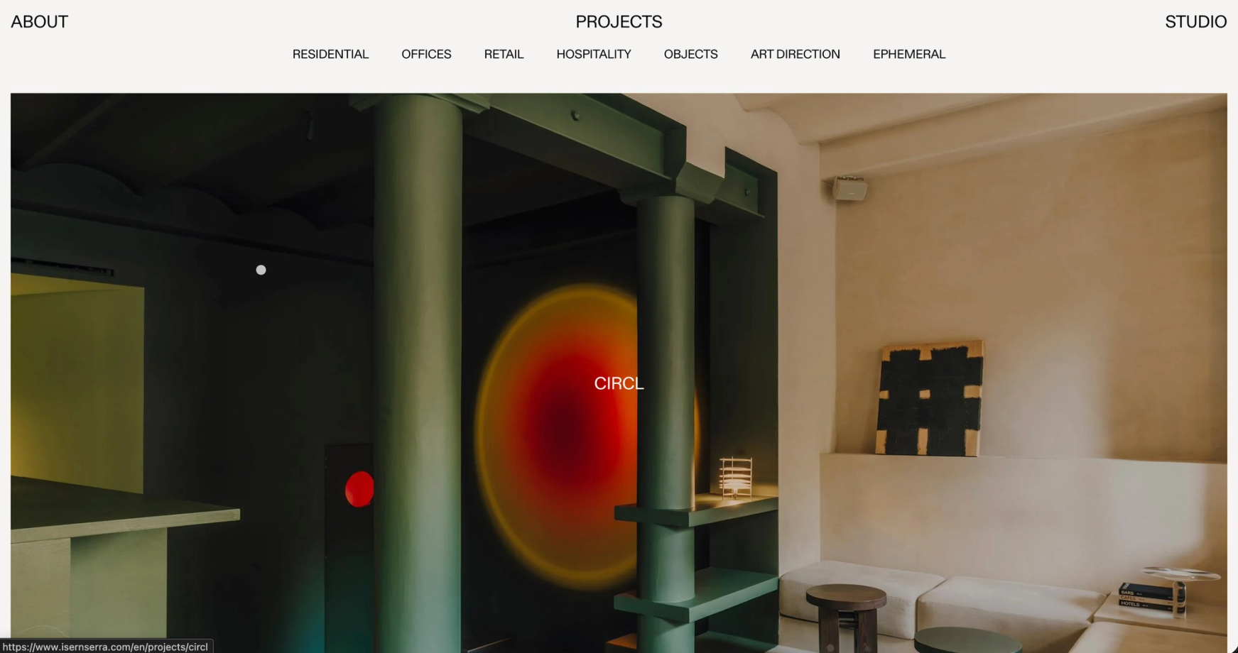
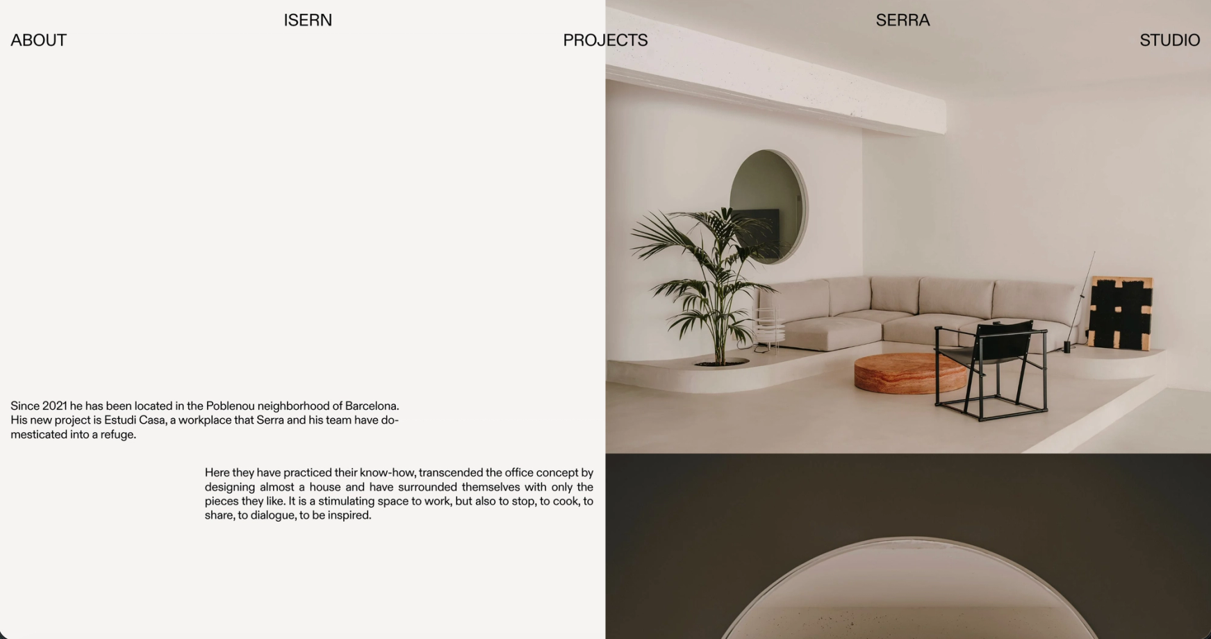
The header is a lattice of five words. Isern and Serra sit apart on the first line, About, Projects and Studio on the second. Open a project and its name takes Isern's place, Close takes Serra's, and the two lines swap. Nothing slides in from the side; the words trade positions.
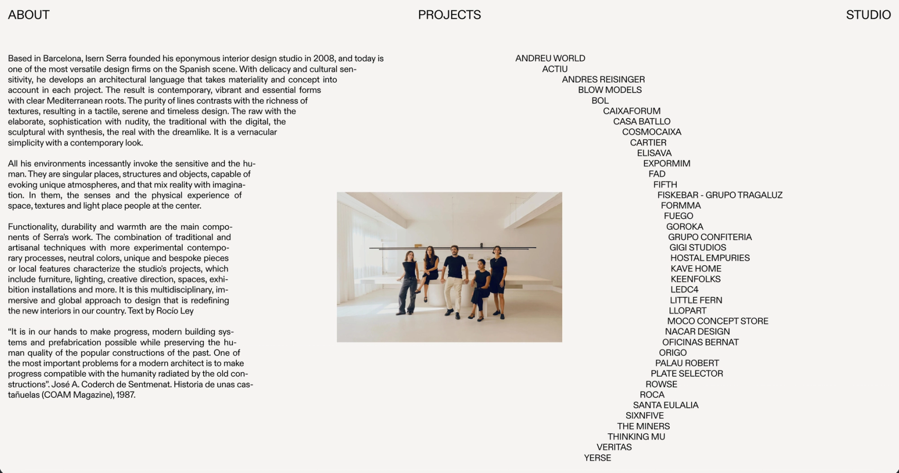
The home page is never finished. One photograph, then another beside it, over it, half through it; images arrive, overlap and dissolve on their own time, so the composition you see is never quite the one someone else sees. Projects is the opposite: sixty-five works in a single column, full width or half, left or right, with air between them, and seven typologies to filter by. The name only appears on hover, in the middle of the picture, next to a dot for a cursor. About sets the client list as a slow curve, each name a step further right and then back, a list you read as a shape.
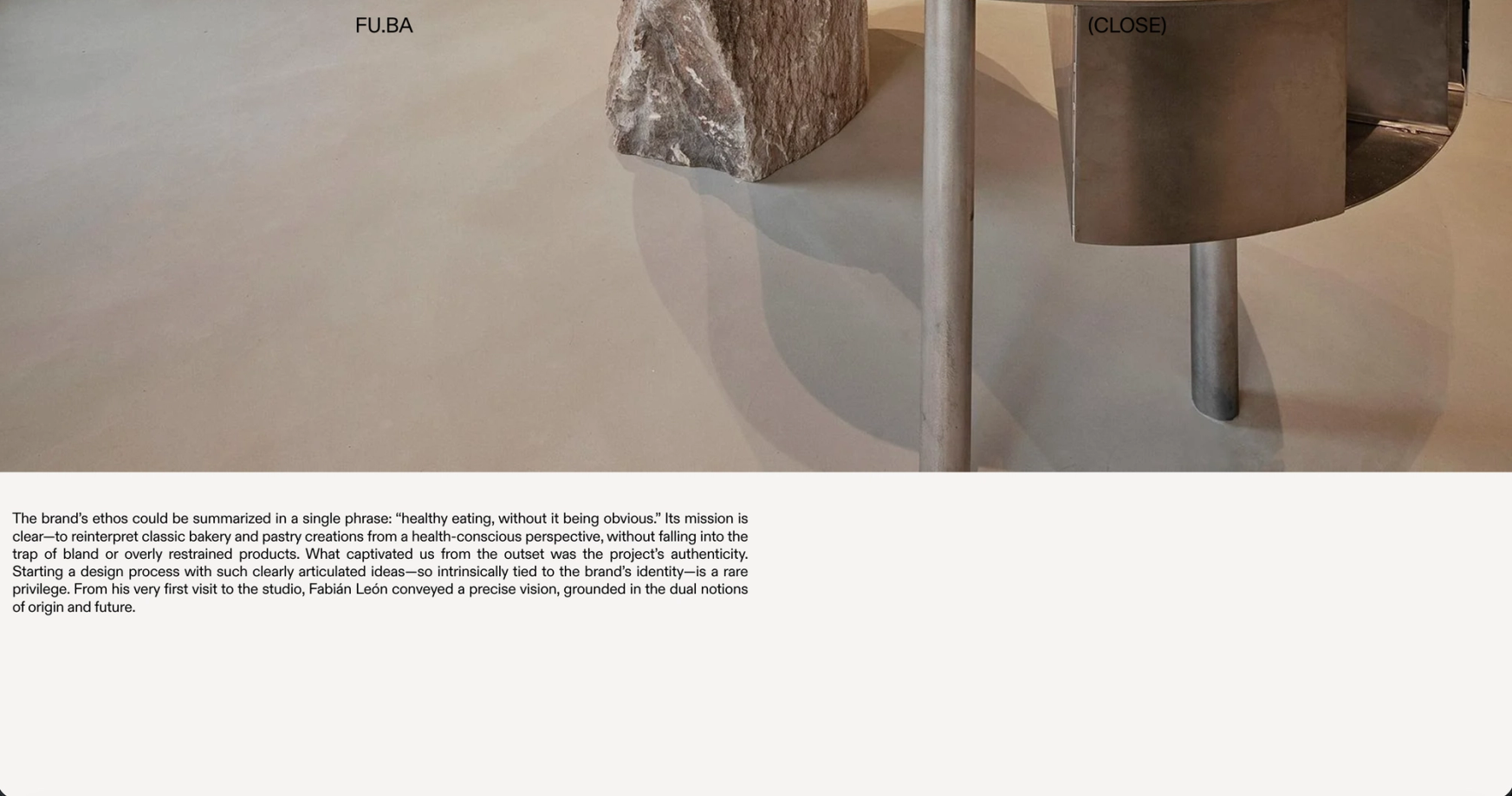
Inside a project, the page is built from blocks. A full-bleed image, a justified column of text on the left half, a pair of photographs, a single one placed right: each block has the positions the design allows and no others. The studio chooses the sequence; the grid keeps it on the rails.
The part nobody sees
The block system is the real product. The admin does not hold a project as a fixed template but as a list of modules, text and image, each with the layout options that came out of the design and nothing more. The studio can give one project a long text and eight photographs, and the next a single line and one, and both come out looking like the same site. Nobody has to ask a developer to move a picture.
Sixty-five projects at these sizes is a lot of photography. Every image is served from one master file per photograph, sized for where it appears, so the long column of Projects loads as you go and a new project adds no weight to the ones already there. The home page collage and the header share one small idea: a fixed set of positions, and content that moves between them. That is what makes them cheap to run and cheap to keep.
Next